For the Love of Type.
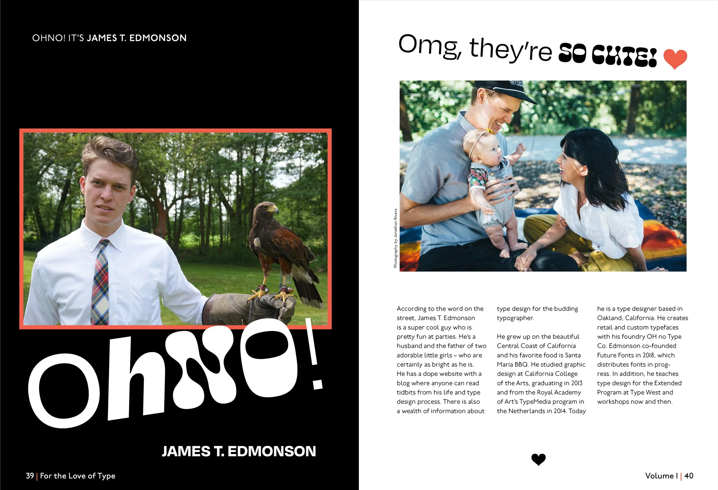
For the Love of Type, is a book designed for a typography course. I combined eight typeface sections designed by different students into one book. I researched and wrote the material about a typeface called Degular, designed by James T. Edmonson of OHno Type Co.
-
James T. Edmonson is a super cool guy and, according to the word on the street, pretty fun at parties. Edmonson is the primary designer for his OHNO foundry. The name OH no Type Co. isn’t just a catchy phrase; it’s rooted in typography. According to Edmonson, the lowercase “n” is a common starting point as it consists of two vertical stems with a space in the middle. Capital “O’s” are curved and demand personal space when next to “n” and “h.” So, O,n, H, and o are super important when it comes to kearning. Playing mental scrabble with these specific letters, Edmonson discovered, “OH no.” It references good kearning and an appreciation for solid typographic craftsmanship. Edmonson says it’s like, “Oh noooo!!!!!”
-
A hamburger-inspired font? Yep. According to Edmonson, the idea for the name Degular arose after polishing off burgers at Sparky’s Giant Burgers in Oakland, California. He and his studio mate and long-time friend Kel had just finished lunch, and Kel said, “The burgers are pretty good here, nothing incredible, just a good, regular degular burger.” Stunned by Kel’s exemplary slang, Edmonson decided it was high time he finished his regular Degular sans serif font and finished what he’d started. And thus, Degular was born.
-
The Ohno designer was hesitant to create a sans-serif font considering it hypocritical due to his strong opinion about the abundance of grotesque in our everyday lives. One day Edmonson skipped lunch. He had spent the day at a coffee shop working intensely to finish Ohno Blazeface Italic. His hunger pains were out of control. A glowing neon Arial sign within a strip mall lured him to burrito land. Under the “TAQUERIA” sign, he realized that Arial and other grotesques work well. They’re legible and functional. While eating his burrito, Edmonson decided to eat his words as well
Contents.
Degular got its name from a tasty burger. Edmonson’s friend commented that it was “just a regular degular burger,” and Edmonson was blown away by his vernacular, and he named the typeface Degular. This is why I included a burger in the contents section.
Anatomically Correct.
-
It all begins with an idea. Maybe you want to launch a business. Maybe you want to turn a hobby into something more.Degular has unique defining characteristics that stand out from more basic sans-serif fonts. Degular Display Black is particularly chonky, as is to be expected. However, it is uniquely tapered or pinched at its joints, similar to the other weights. Its geometric style is arguably the most apparent in its Display version and the counter of the O is nearly a perfect circle.
-
Degulars’ funny-looking joints are also called ink traps. The notches are a stylistic design decision, but ink traps are a functional printing technique created to minimize ink spread – the traps ensure crisp letterforms. When the type is printed, ink fills the traps.
-
The crossbar of the “A” sits below the centerline. Edmonson asserts that a crossbar at the centerline is “ugly af” because the top and bottom negative spaces are unbalanced. A somewhat tapered joint in the lowercase “a” is important because an even stroke weight would make the joint look heavy and clunky. Degular’s capital “B” has an ink trap joint that looks like a “buttcrack” The bottom bowl extends slightly beyond the top bowl, so it has a bit more negative space. The stroke on the lowercase ‘b” overshoots the cap-height, which helps readers because it differs from the I, l, and 1. The capital letter “C” has overshoots which allows it to appear the same size optically as the other capital letters. This is because letters like “H” and “I” have terminals that end in a solid mass, so they hold more visual weight at the baseline and cap-height. The “C’s” terminals begin and complete the stroke, and they are similar to the terminals on the G and S.
Section Dividers
Each designer in my group had a uniquely designed section. To keep the book cohesive and inform readers of a new section, I designed pages to separate the groups. In an interactive pdf, readers can click on the contents and jump to the section page.


