Web Design in Adobe XD.
Designing for the web combines valuable user-driven research, behavioral psychology, and visual design. Misty Copeland’s website is a student project that incorporates UX experience principles with a user-friendly visual interface. I chose Copeland because she broke a glass ceiling as America’s first black Prima Ballerina. I admire her grace and stamina.
Familiarity + Visual Cues
The website header is familiar to users because the navbar is located at the top of the page where navigation links are typically found. Users can find information quickly and easily. Visual cues such as the dots along the side of the page allow users to orient themselves as they scroll vertically through the home page.
Consistency.
The typography, color scheme, page number, and page title are consistent throughout. Mrs. Eaves and Niveau grotesque are classy typefaces that add elegance and hierarchy to Copeland’s web page.
Variety.
Alternating photography + copy adds visual interest to the design while maintaining a strong visual theme.
Headlines + Photography.
UX: Users recognize symbols like the play button and understand that headerlines paired with icon images are links to news articles.
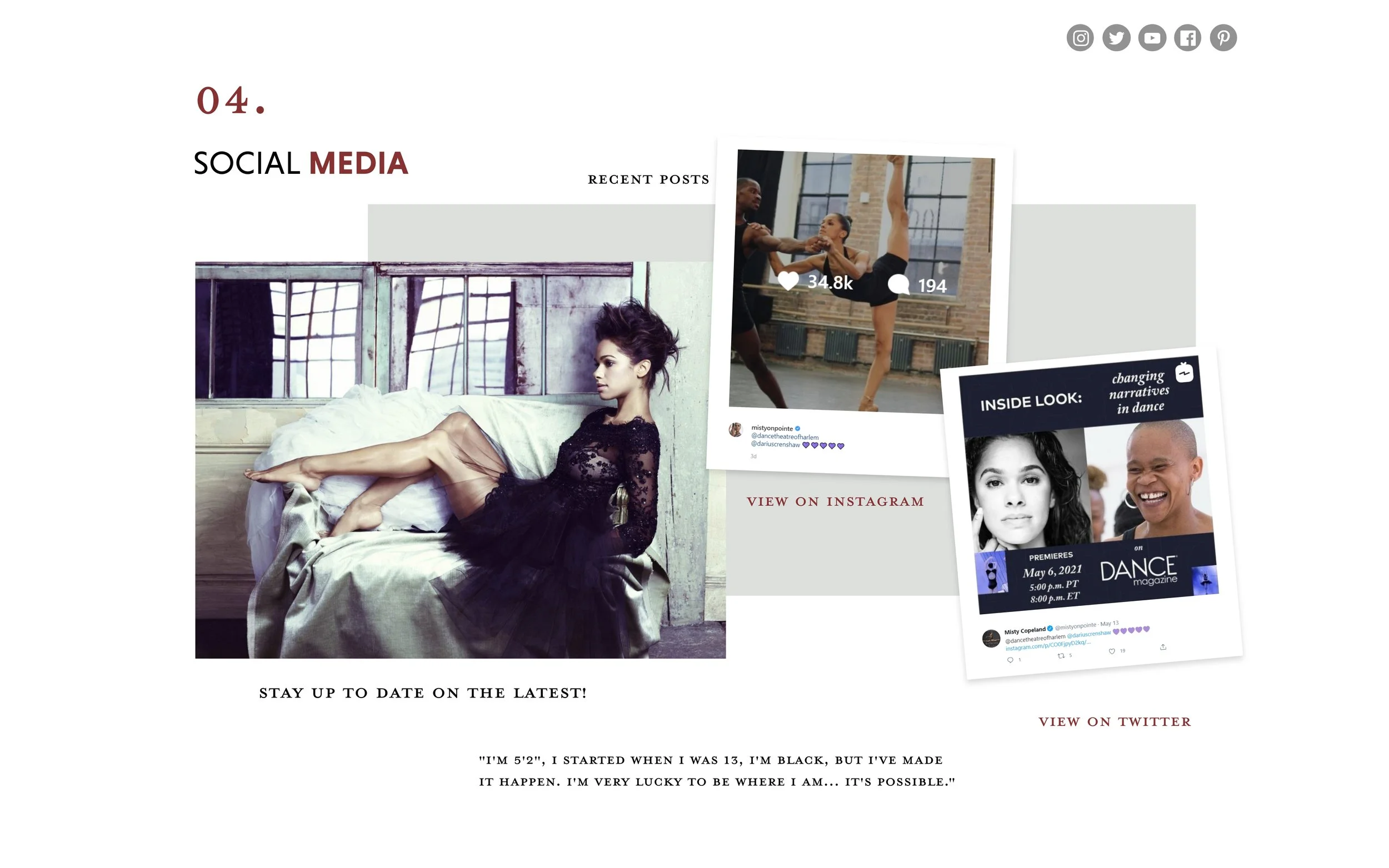
Social.
Users are most likely to keep up with Misty on social media. Convenient links to her official accounts keep fans interested. Off-center images of past social media posts provide a dynamic look and feel to the page design and drop-shadows give a layered effect.
Gallery.
Fans love images of Misty, so making sure they have a place to view her stunning portraits was a must. The “view complete gallery” button is large and in an eye-catching color consistent with the site design. Finally, corners catch users’ eye, drawing attention to the button.
Store.
Prominent links help users quickly identify the call-to-action buttons connecting buyers to Misty’s store, Barnes & Nobel, and Amazon. Bold text provides a quick overview, with the option to learn more about the books.
Footer.
The footer has three sections for users. They can easily navigate the site, contact Copeland PR for media, or subscribe. The subscribe button is last because it requests users to give back. By requesting information after providing information, users are more likely to provide their email. Social links are provided additionally to keep users connected and interested.


